Tariffs and Trade Updates and Information, chambercheck.ca

Tariffs and Trade Updates and Information, chambercheck.ca

When our members thrive, so does our community.










Chamber Gateway TV
Visible to approximately 100,000 cars per day
(40,000 South Bound, 60,000 North Bound)
Message displayed approx. 1500 times per day (based on both sides)
Great exposure. Working for you 24/7 targeting mass market
Located at 750 Hespeler Road (Hespeler Road and Eagle Street)

Animated Ads are much more dynamic and are 2 to 4 times more effective, than static.
Animated Ads, 10 Seconds Displayed North & South Bound on Gateway TV
ANIMATED ADS PROVIDE THE BEST VALUE - DOUBLE THE TIME!
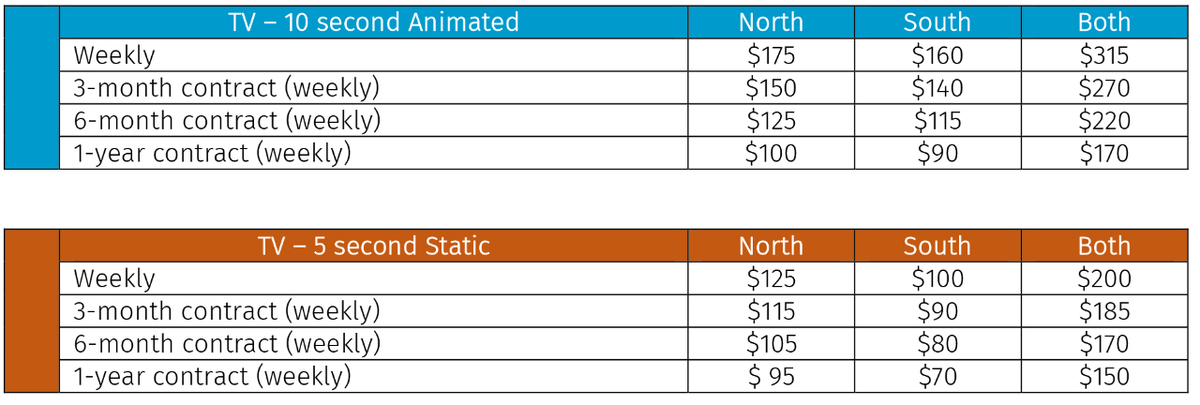
HST extra
STATIC: Files Format Accepted: JPEG, BITMAP. Ads must be provided as RBG
VIDEO: MPEGS AND GIFS FOR video.
SPECS: 352 pixels x 304 pixels
Agreement Form, Terms and Conditions
Tips for Effective Outdoor Signage
Limited word count – effective signs should have a word limit. Too many words on a sign can be only distracting.
Essential information only – the words on your sign should convey only what customers need to know. Examples include – Company name, Phone number, Website URL, Slogan, Call to action
Foreground/background colors – When choosing a background for your design, don’t use anything that will make it difficult to focus on the main message. Black contrasts well with any light color, and white works well with colors having a dark value. Avoid using white backgrounds, it can be blinding at night and messaging can go unread.
Type and fonts – In general, clean, crisp, easy-to-read type styles should be used for maximum legibility. Most professional fonts have varying weights, ranging from regular to bold, black, extended, etc. Use these to your advantage by giving priority or preference to certain parts of your message.
As a general rule of thumb, never use more than two different fonts in a single design. Choosing two fonts that complement each other can make your message stand out. Most importantly, use fonts that are clearly legible when viewed from a distance.
Following the guidelines above will ensure that your sign is readable, and your message gets across clearly to its intended audience.



 750 Hespeler Road Cambridge, ON N3H 5L8
 Phone: 519-622-2221
 Fax: 519-622-0177
 Member Login